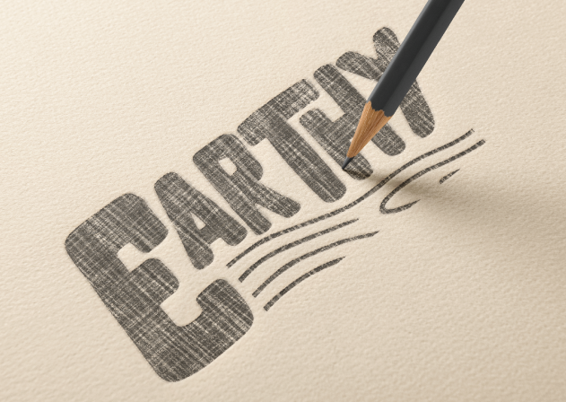
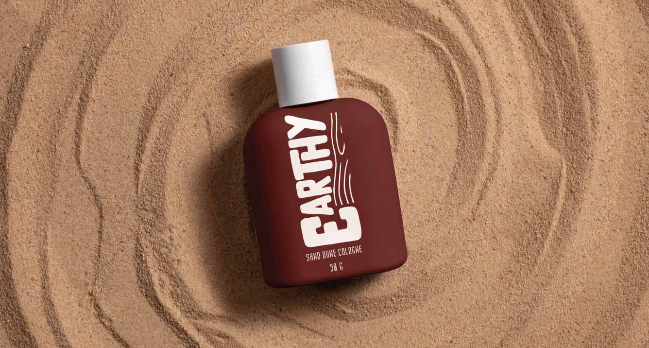
The client was looking to make their Earthy cologne stand out in a market full of luxury approaches. They wanted a logo that was fun, hipster and went “against the grain”. The packaging needed to be simple and give an affordable but quality look to it. As it is in the name, everything about this product is Earthy and natural. The owner is from PEI which is why the colour resembles red dirt. The font is natural, man made looking, and is designed to go against the wood grain (quite literally). The packaging design is bold and simplistic, showcasing the unique logo. Men in their earthy era are going to love this cologne and going against the grain!