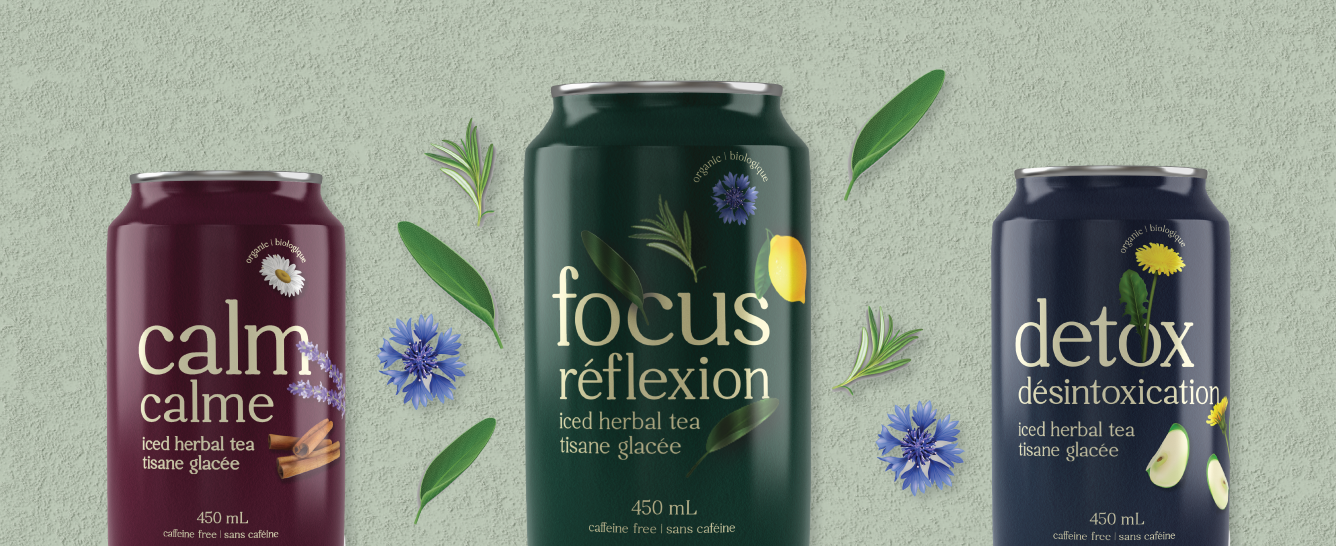
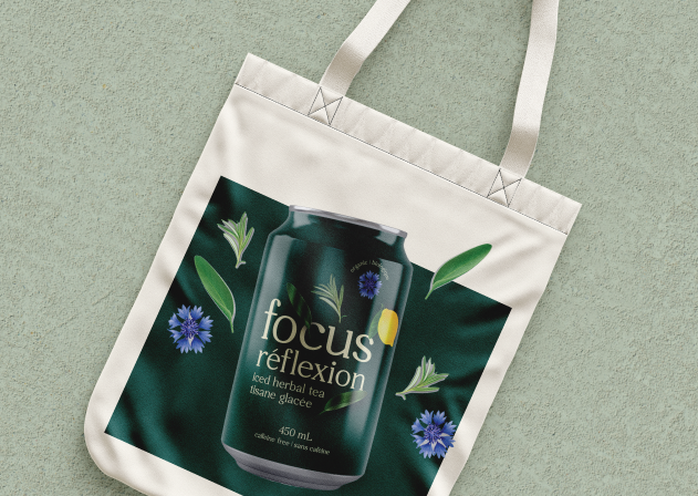
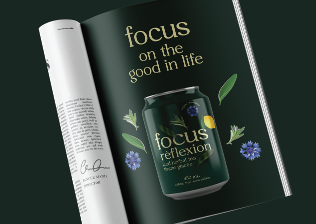
The client was looking for an ingredient focused design that also showcased the benefits of their iced tea for the consumer. The packaging had to have a very natural and approachable look to it. The beige colour used for the font adds to the natural look and feel. The design makes it easy to tell what ingredients are in the product as well as the health benefits for the consumer. With the ingredients “jumping off” the can, it helps to highlight the bold flavours of the iced teas. These bold and punchy designs will stand out to the busy mom’s who are looking to gain some focus and feel more grounded in their day to day lives.